The kitchen is often referred to as the heart of the home, but it is also one of the most significant financial investments you will make in your property. While it is tempting to follow the latest interior design trends—like the avocado green of the 1970s or the Tuscan gold of the early 2000s—these "fad" colors can quickly make a home feel dated.
When it comes to cabinetry and large surfaces, choosing a timeless color palette is the smartest strategy. It ensures your kitchen remains stylish for decades, maintains high resale value, and provides a flexible backdrop for evolving decor. Here are the kitchen colors that never go out of style.
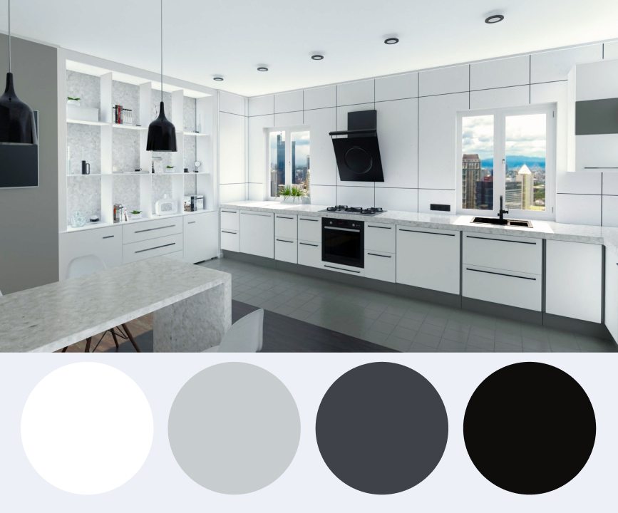
1. The Gold Standard: Pristine White
White is, and likely always will be, the most popular choice for kitchens. There is a reason for its enduring dominance: white feels clean, airy, and bright.
- Visual Expansion: White reflects light, making even the smallest galley kitchen feel more spacious and open.
- Versatility: A white kitchen acts as a blank canvas. Whether you want a modern minimalist look, a rustic farmhouse vibe, or a traditional aesthetic, white cabinetry adapts to all of them.
- Visual Expansion: White reflects light, making even the smallest galley kitchen feel more spacious and open.
- Resale Value: Real estate experts consistently point to white kitchens as the most attractive feature for potential buyers.
Pro Tip: To prevent a white kitchen from feeling clinical, incorporate natural wood elements, a textured backsplash, or metallic hardware in brass or matte black.
2. Sophisticated Grey: The Modern Neutral
Over the last decade, grey has transitioned from a trend to a certified classic. It offers a softer alternative to white while remaining neutral enough to pair with almost any accent color.
- The Spectrum of Grey: From pale "greige" (a mix of grey and beige) to deep charcoal, grey provides incredible depth.
- Timeless Appeal: Light greys are excellent for creating a serene, calm environment, while darker charcoals add a touch of drama and sophistication without the harshness of pure black.
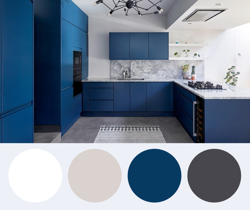
3. Classic Navy Blue: Bold Yet Grounded
If you want to step away from neutrals but still want a "safe" color, navy blue is your best ally. Navy has been a staple in high-end kitchen design for generations, often associated with nautical or "Hamptons" styles.
- High Contrast: Navy cabinetry paired with white marble countertops creates a stunning, high-contrast look that feels expensive and intentional.
- Grounded Feeling: Because navy is a dark, cool tone, it feels stable and grounded. It works exceptionally well on lower cabinets or a kitchen island to anchor the room.
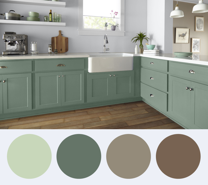
4. Earthy Sage Green: Nature’s Neutral
Green is having a significant moment in design, but "Sage" specifically is considered a timeless choice. Because it mimics colors found in nature, it creates a soothing, biophilic atmosphere that humans instinctively find comfortable.
- Subtle Color: Sage green is muted enough to function as a neutral. It brings life into the room without being overwhelming.
- Perfect Pairings: It looks magnificent with natural oak flooring, terracotta tiles, and unlacquered brass fixtures.
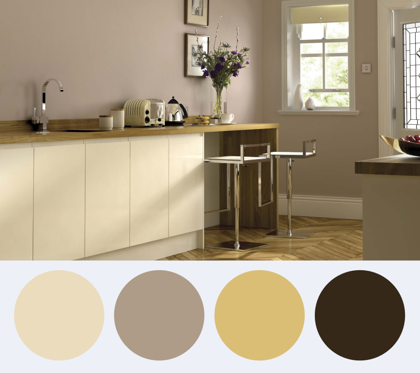
5. Warm Neutrals: Cream, Sand, and Beige
As design shifts away from the "cool grey" era, warmer neutrals are making a massive comeback. Creams and beiges provide the brightness of white but with an added layer of "hygge" or coziness.
- Depth and Warmth: These shades prevent a kitchen from feeling cold. They are particularly effective in homes with lots of natural light.
- Long-Term Flexibility: Much like white, these colors are incredibly easy to update with different hardware or wall colors over the years.
The Role of Materials and Lighting
A timeless color only works if it is supported by the right materials and lighting.
- Lighting: These shades prevent a kitchen from feeling cold. They are particularly effective in homes with lots of natural light.
- Materials: Natural stone (like marble or soapstone) and real wood are the ultimate companions to a timeless color palette. They age gracefully and never look "out of fashion."
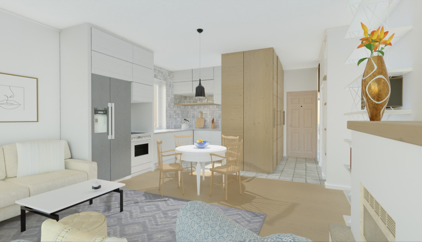
Visualize Your Timeless Kitchen with Roomtodo
Choosing a kitchen color is a big commitment. You shouldn't have to guess how navy cabinets will look with your specific floor tiles or how a sage green island will feel in your layout.
The Roomtodo kitchen planner is the ultimate tool for testing timeless palettes:
- Instant Color Swapping: Use our materials library to change cabinet colors, wall paints, and floor textures in a single click.
- Realistic Lighting Simulation: See how your chosen "timeless" hue looks under different lighting conditions in a 3D environment.
- Explore Combinations: Not sure about the 60/30/10 rule? Use Roomtodo to balance your dominant, secondary, and accent colors to perfection before buying a single drop of paint.
Don't just choose a color—experience it.
Start designing your timeless kitchen for free with Roomtodo!
