Please follow the link in the email to activate your account
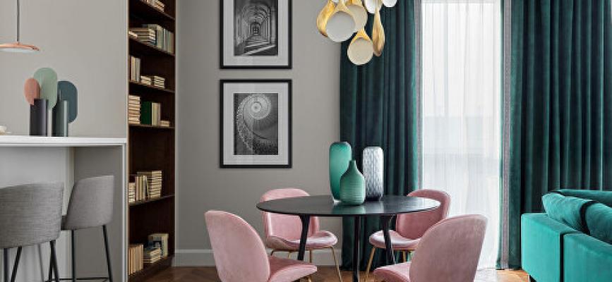
Have you ever noticed how perfectly colors complement each other if the renovation is done by a designer, and how poor the room can look with badly chosen colors? Sometimes a wrong combination can ruin the impression completely. The color game is very hard when it comes to decorating. But we got your back here. Just start with big details – like floor or walls. Learn some tips about matching the colors, use 3D interior design online tool for trying them out and decorate like a pro!
First, you need to decide what function the room will perform. And then choose the best suitable color for it. The idea of monochromatic decoration lies in using the shades of the same color. For example, if the walls are painted blue, you can add some light blue and dark blue details. A great way to stick to one mood but keep it interesting.
Neutral, basic colors, such as white, black, grey and beige, can create a cozy combo. And considering the number of shades some of them have, you can always pick something for your house. By the way, even if you have the room designed differently, basics can be added as details – the only thing you should care about is the matching shade.
This is the scheme that designers often turn to. The color wheel shows the colors which complement each other creating a nice mix. If you want to do monochrome – use the shades placed together. If you need contrast – use the opposite shades. Just give it a try via Roomtodo planner and see how simple it is.
Bright shades are believed to bring energy and inspire creative actions. Though this idea is great for the office or working cabinet, stay away from these solutions in the bedroom or living room. Because chances are that you will not be able to relax and have rest there. There, you want to keep things nice and calm. So muted shades are your way to go.
When you pick a color for a bedroom or a kitchen, take into consideration that it always brings more than the appearance of a room – it creates the mood. Psychologists claim that each shade has its own hidden meaning and is capable of setting you to some thoughts. For example, white stands for innocence and new beginnings, whilst blue is about harmony, peace and sympathy. So, picking the paints for the apartment, always pay attention to the psychological side of each option and do not forget about color harmony, as now you know how to take advantage of it.
