The world of interior design is often perceived as subjective, ruled by taste and trend. Yet, beneath the layers of colour swatches and fabric samples lies a foundation of mathematical principles that guide truly successful spaces. Among these principles, the 60/40 Rule stands out as a simple yet powerful guideline for achieving balance, flow, and visual appeal in any room.
If you’re seeking a secret weapon to transform your space from merely functional to elegantly curated, this rule—an accessible approximation of the revered Golden Ratio—is your answer.
What exactly is the 60/40 Rule?
At its core, the 60/40 rule is a proportioning technique used to distribute visual weight in a design. It dictates that elements within a space should be divided into two contrasting parts:
- 60%: The dominant element, acting as the primary focus, foundation, or main direction.
- 40%: The complementary element, providing contrast, depth, and secondary interest.
Unlike the 60/30/10 rule, which is specifically for colour allocation, the 60/40 rule is far more versatile, applying to space, materials, styling, and even the combination of design styles. It ensures that your room has enough structure (the 60%) to feel grounded, while also containing enough variation (the 40%) to feel dynamic and prevent monotony.
Application 1: Creating Flow and Scale (The Layout Ratio)
Perhaps the most practical use of the 60/40 rule is in defining the relationship between furniture and negative space. A common mistake in room planning is either overcrowding a space or leaving it feeling sparse and uninviting. The 60/40 rule provides a blueprint for perfect furniture placement:
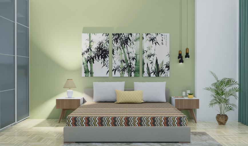
- 60% Occupied: Allocate approximately 60% of your room’s total floor area for furniture, main activity zones, and functional pieces. This is where your large anchor items—sofas, beds, dining tables, and built-ins—will reside.
- 40% Clear: Reserve the remaining 40% as negative space, or "breathing room." This area is crucial for circulation, pathways, and ensuring the room doesn't feel cluttered or heavy.
Practical Example: Imagine a large living room. The 60% might include the main seating arrangement (sectional sofa, armchairs, and coffee table). The 40% is the pathway leading into the room, the distance between the seating and the media console, and the open area near a window. By consciously leaving 40% of the floor clear, you naturally improve traffic flow and allow the key pieces to stand out.
Application 2: Colour and Contrast (Dominance vs. Depth)
While the 60/30/10 rule is the classic method for colour schemes, the 60/40 ratio works brilliantly for simpler two-tone palettes or when thinking about general colour weight:
- 60% Dominant Colour: This colour is the background and foundation of the room. It covers the largest surfaces: walls, flooring, ceilings, and the biggest furniture pieces (like the main sofa). Typically, this is a neutral or a muted shade that creates a sense of calm and visual rest.
- 40% Complementary Colour/Accent: This provides the contrast and personality. It is spread across secondary furniture (accent chairs, side tables), textiles (rugs, curtains), and key accessories. If you love a bold colour, ensure it’s part of this 40% to keep the overall scheme balanced and less overwhelming.
Tip for Textures: The same logic applies to materials. Aim for 60% of your visible materials to share a commonality (e.g., smooth finishes like polished wood and stone), and use 40% for contrasting textures (e.g., woven rugs, leather, metallic accents) to add tactile depth.
Application 3: The Art of Styling and Accessorising
The 60/40 rule is your guide to preventing "clutter creep" on shelves, consoles, and tabletops. It’s all about creating balanced vignettes where objects complement, rather than overwhelm, the surface:
1. Coffee Table and Console Styling
When styling a surface, aim for the display items to occupy roughly 40% of the area, leaving 60% of the tabletop exposed. If you're arranging items on a decorative tray:
- 60% Anchor Piece: A substantial item that holds visual weight (e.g., a stack of books, a large vase, or a decorative box).
- 40% Secondary Items: Smaller, complementary pieces that add sparkle or height (e.g., a candle, a small sculpture, or decorative beads).
2. Gallery Walls and Art Placement
When hanging art or curating a gallery wall, the ratio ensures the pieces don't feel too sparse or too dense:
- 60% Covered Space: The actual surface area covered by your artwork, frames, or collection.
- 40% Negative Wall Space: The blank wall area surrounding the art.
This proportion is critical for visually pleasing art displays, giving each piece enough room to be appreciated without blending into a chaotic mass.
Why the 60/40 Rule Works: The Golden Ratio Connection
The reason the 60/40 split feels so instinctively right is that it mirrors the Golden Ratio (Phi, or approximately 1.618:1). This mathematical proportion, which can be visually approximated by the 60/40 division, has been used for centuries in art, architecture, and nature because the human brain finds it inherently pleasing and harmonious.
By adopting the 60/40 mindset, you are essentially harnessing a powerful, timeless design formula that:
- Establishes a Focal Point: The 60% dominant element always guides the eye.
- Creates Visual Rest: The 40% ensures there is sufficient negative space for the eye to relax.
- Adds Professional Structure: It elevates your design beyond simple arrangement, making choices regarding size and placement feel intentional and well-thought-out.
The beauty of the 60/40 rule lies in its flexibility. It's not a rigid measurement but a guideline for proportion. You don't need a calculator; you need to train your eye. Start by looking at your space and asking: "Does this feel like 60% foundation and 40% interest?"
By applying the 60/40 rule to your layouts, colour schemes, and accessories, you are guaranteed to create interiors that are not just beautiful, but also functionally balanced and universally appealing.
Time to Put the Ratio into Practice!
Understanding the 60/40 rule is the first step—visualizing it is the next. Before moving a single piece of furniture, use the Roomtodo 3D planner to map out your space and test different proportions.
Our intuitive tool allows you to:
- Precisely measure the 60% occupied space and the 40% negative space.
- Experiment with colours and textures to perfect your 60/40 balance.
- See your design in a realistic 3D environment before making any costly real-world decisions.
Ready to design with perfect proportion?
Start Planning Your 60/40 Space with Roomtodo Today!
