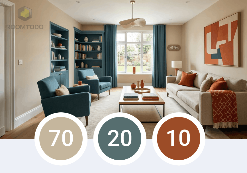
One of the most common challenges for DIY decorators is choosing a color palette that feels balanced rather than chaotic. Professional designers rely on a timeless "secret" to achieve perfect harmony: The 70/20/10 Rule.
This simple ratio ensures that your space has enough variety to be interesting, but enough consistency to feel unified.
How the Ratio Works
The rule suggests dividing your room’s color scheme into three distinct percentages:
|
Percentage
|
Role
|
Elements Included
|
|
70%
|
Dominant Color
|
Walls, large area rugs, and primary furniture pieces.
|
|
20%
|
Secondary Color
|
Upholstery, curtains, accent chairs, and smaller rugs.
|
|
10%
|
Accent Color
|
Throw pillows, artwork, lamps, and decorative accessories.
|
Breaking Down the Components
The 70%: Your Foundation
The dominant color acts as the backdrop for the entire room. Usually, this is a neutral tone (like beige, white, or soft grey) that allows other elements to shine without overwhelming the senses.
The 20%: The Support
The secondary color should complement the dominant one while providing enough contrast to define the space. Think of this as the color that gives the room its specific "mood"—perhaps a calming blue or a warm terracotta.
The 10%: The Spark
This is where you can have fun! The accent color is your chance to inject personality and boldness. Since it only occupies 10% of the space, you can use vibrant or dark shades that would be too intense for the walls but look perfect on a vase or a velvet cushion.
Why This Rule is a Game-Changer
The 70/20/10 rule works because it mimics the natural balance found in art and nature. It prevents a room from looking "too matched" (using only one color) or "too busy" (using too many colors in equal amounts).
Pro Tip: If you’re feeling adventurous, you can try the 70/20/5/5 variation, where you split the accent color into two different shades for even more depth.
Visualize the Rule with Roomtodo
Testing color ratios in real life can be expensive and time-consuming. This is where Roomtodo becomes your most valuable design tool:
- Experiment with Percentages: Apply different colors to your walls (70%) and furniture (20%) instantly to see if the balance feels right.
- Swap Accents in Seconds: Not sure if a gold or a navy accent (10%) works better? Swap decor items in 3D and see the result immediately.
- Walk Through Your Palette: Use the first-person view to experience how your chosen colors look as you "move" through the room.
Stop guessing and start designing with confidence.
Create your 70/20/10 color scheme for free with Roomtodo!
