Please follow the link in the email to activate your account
The right combination of contrasting colors is the key to success for a designer. You need to understand the theory to play with the colors in practice. Speaking of contrasts, we mean the opposition: black to white, dark to light. But everything is much more complicated.
Johannes Itten is a well-known color researcher, creator of the color wheel, and Swiss artist. His works have great weight in many fields and help various specialists. There are 7 types of contrasts in colorism:
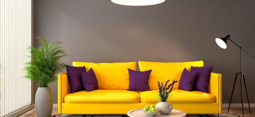
Additional colors are also called complementary colors. Their combination emphasizes the shade of one of them and enhances perception. Some common examples are:
Experienced stylists use pairs and complementary triads when one tone replaces two neighboring ones in a circle. It is convenient to experiment with the palette and visually apply it to your interior with the help of a 3d interior design program. Such applications allow you to create a picture of your future apartment or room.
Designers use coloristic techniques by combining them. Different sizes of color spots with contrasting complementary shades and other configurations can be combined in the same room.
Choosing the right tone in the interior is very important. It is necessary not only for visual perception but also for psychological. Some of the popular complementary combinations are lavender and soft yellow. With the correct interaction, the shades look balanced and perceived by a person in harmony. This composition is used as a base and can be diluted with white, beige, peach, and mint shades.
Orange and blue are harmonious classics. These shades are often used in nautical themes. The combination of warm and cold offers scope for imagination. The deep burgundy and emerald tones can create a noble and refined interior. It would be best if you were careful with red and green shades; this pair is the most difficult of all the complementary colors. The combination can be a winner for the room and a killer for the entire design. It's worth using an app to create a future room layout to avoid mistakes.
